
Hello there, the aim of this post is to help you master AI image generation as a student and professional. You will learn how to create studio-quality event flyers, Midjourney presentation slides, and free project art on a student budget.
Every academic semester, campus organizations face the exact same expensive hurdle. Departmental associations plan annual dinners. Student politicians launch high-stakes campaigns for union seats. Campus fellowships organize meetings and conferences. Engineering, medical, and business students prepare for grueling final-year project defenses.
All these initiatives share a critical requirement: high-impact visual design.
Traditionally, student leaders spend substantial amounts of money hiring freelance graphic designers on campus. These designers often deliver delayed work, miss urgent printing deadlines, or reuse generic templates found on the internet. Meanwhile, students preparing seminar presentations settle for standard, uninspiring stock photos. They download grainy web images showing foreign corporate workers in business suits. These generic visuals completely fail to connect with local campus audiences.
Artificial intelligence has completely disrupted this design landscape. Modern AI image generators allow anyone to produce studio-grade visuals in minutes. You do not need expensive graphic design degrees or mastery over complex software suites. By understanding the fundamentals of visual prompting, students can generate photorealistic event marketing assets and thesis visuals directly from a smartphone or laptop.
This comprehensive guide delivers an end-to-end masterclass on AI image generation for students. You will discover the best free and budget-friendly tools, master the exact anatomy of high-converting prompts, learn how to upscale graphics for massive auditorium screens, and understand the critical ethical boundaries governing academic AI use.
The Hidden Cost of Campus Graphic Design
Student organizations operate on razor-thin budgets. Faculty associations rely on departmental dues that students struggle to pay. Campus clubs fund their events through small member contributions and meager executive sponsorships.
A standard campus event campaign requires multiple visual assets:
- Square WhatsApp and Instagram announcement flyers.
- Vertical WhatsApp status and Instagram story updates.
- Printed roadside posters and massive flex banners for campus gates.
- Custom name badges, speaker spotlights, and branded event programs.
When student executives pay freelance designers ₦15,000 to ₦50,000 per design package, they drain their operating capital rapidly. Furthermore, academic seminars suffer from acute visual fatigue. Lecturers and external project defense examiners sit through dozens of student presentations every single day. When an examiner sees slide after slide of dense, unformatted bullet points, their attention vanishes.
Using free AI art for projects and marketing changes the game completely. It democratizes professional design. It allows a student fellowship with zero budget to produce graphics matching the visual quality of multinational creative agencies.
Choosing the Right Tools on a Student Budget
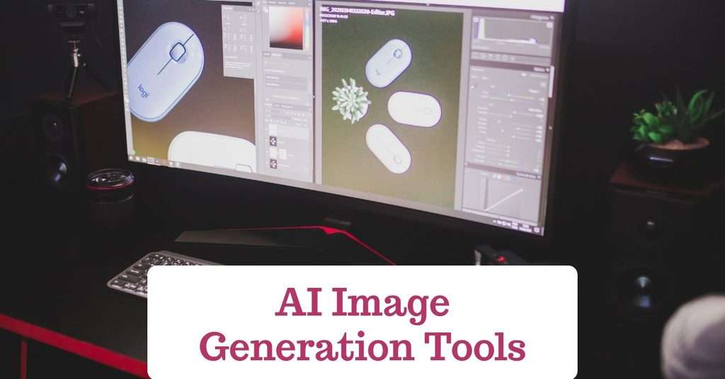
You do not need to spend huge sums of money on enterprise software subscriptions. Several world-class generative AI platforms offer generous free tiers or highly affordable access points for students. Below is a list of AI image generation platforms for A+ campus presentations and event marketing:
1. Microsoft Designer and Bing Image Creator (DALL-E 3)
- Cost: Completely free (Requires a standard personal Microsoft account).
- Best For: Everyday campus flyers, rapid concept mockups, and vibrant presentation illustrations.
- Why It Works: Powered by OpenAI’s DALL-E 3 engine, Microsoft Designer excels at understanding complex, conversational natural language prompts. It interprets prepositions, positioning, and context accurately. It provides daily “boosts” for fast generation, after which it still generates images at a steady pace without charging a dime.
2. Leonardo AI
- Cost: Freemium (Offers 150 free generation tokens renewed every 24 hours).
- Best For: Photorealistic portraiture, cinematic lighting, and custom digital art.
- Why It Works: Leonardo AI gives users granular control over generation parameters. You can select custom image models, adjust contrast ratios, and use reference features to upload a rough sketch and convert it into a finished digital painting. Its daily token renewal makes it an absolute favorite for cash-strapped campus executives.
3. Ideogram AI
- Cost: Freemium (Provides free daily credits).
- Best For: Typography, event titles, and graphic t-shirt mockups.
- Why It Works: Historically, AI generators failed catastrophically at rendering readable English text inside images. They generated scrambled gibberish instead of clear letters. Ideogram completely solved this problem. It accurately renders bold headings, event dates, and quotes directly inside generated posters, making it a powerful engine for campus event flyer production.
4. Midjourney
- Cost: Paid subscription model.
- Best For: Executive campaign materials, documentary-grade photojournalism, and publication-quality architectural concepts.
- Why It Works: Midjourney remains a global industry leader in aesthetic coherence, micro-textures, and realistic surface materials. If you are running for Student Union Government (SUG) President or pitching a venture-backed startup idea to corporate investors, Midjourney for presentations provides unmatched visual sophistication.
The Art of the Prompt: Mechanics of Visual Engineering
Typing a vague instruction like “give me a cool church flyer” or “make a picture of an engineer for my project” will always produce generic, unusable results. Generative models do not understand human intent unless you provide explicit visual parameters.
Professional visual prompting follows a modular engineering formula:
Prompt Formula:
Subject + Medium or Style + Environment and Lighting + Composition and Framing + Color Palette + Technical Parameters
Deconstructing the Key Visual Levers
1. The Subject and Core Action
Define the focal entity explicitly. State ethnicity, age, clothing, posture, and facial expression. Instead of “a student,” specify “a focused 20-year-old African university student wearing modern optical glasses and a navy blue blazer.”
2. Artistic Medium and Style
Tell the AI how the image was captured or rendered:
- For Scientific and Business Slides: Editorial studio portrait, clean corporate photography, hyper-detailed 3D isometric render.
- For Architecture and Civil Engineering: Minimalist ink architectural cross-section, fine-line technical pencil drafting, modern blueprints on parchment.
- For Campus Socials and Concerts: Cyberpunk neon digital illustration, vibrant vector pop art, retro 90s vintage film grain photograph.
3. Lighting and Atmosphere
Lighting defines the emotional mood of your asset:
- Cinematic Volumetric Lighting: Creates visible light rays streaming through windows, perfect for serious academic or spiritual themes.
- Rembrandt Lighting or Golden Hour: Casts warm, professional amber tones across subjects, ideal for executive profile headshots.
- Bright Studio High-Key Lighting: Eliminates harsh shadows, producing clean, friendly commercial graphics for campus businesses.
4. Aspect Ratio Controls
Never crop a square image manually to fit a wide presentation slide. This destroys image quality and ruins framing. Use the software’s native aspect ratio controls:
- Use a 16:9 ratio for standard PowerPoint, Google Slides, and wide projector screens.
- Use a 4:5 or 1:1 ratio for WhatsApp status, Instagram feeds, and mobile banners.
- Use a 9:16 ratio for full-screen vertical smartphone flyers.
Anatomy of an A+ Prompt Breakdown
To see this formula in action, observe how an everyday engineering prompt is structured layer by layer:
- Subject: A dynamic close-up portrait of a young African female chemical engineer.
- Action & Medium: Holding a glass beaker of glowing blue liquid, captured as award-winning studio photography.
- Lighting & Camera Specs: Dramatic cinematic rim lighting, shallow depth of field, 85mm lens, f/1.8 aperture.
- Environment & Technical Output: Clean corporate laboratory background, ultra-sharp focus, 8k resolution, widescreen 16:9 aspect ratio.
When assembled into a single line, these parameters provide the AI with unmistakable instructions, yielding an elite, context-rich graphic.
Ready-to-Use Prompt Templates for Campus Life
Copy, adapt, and paste these proven formulas into your preferred image generator to produce instant, high-quality results. Here are four ready-to-use templates for you:
1. The SUG / Faculty Election Campaign Asset
Editorial studio campaign photograph of a charismatic 22-year-old West African male student leader, standing confidently with arms crossed, smiling warmly, wearing a crisp tailored dark emerald-green suit jacket over a white shirt. Soft diffused studio key lighting, subtle charcoal gradient background, shot on 100mm lens, shallow depth of field, photorealistic, ultra-clean commercial look, 4:5 aspect ratio.
2. Campus Technology/Hackathon Event Background
A futuristic digital workspace background for a university software hackathon, modern glowing neon cyan and deep violet accents, abstract data visualization nodes hovering in mid-air, dark sleek university auditorium setting in the background, cinematic atmospheric haze, dynamic isometric view, modern tech aesthetic, clean negative space in the center for typography overlay, 16:9 aspect ratio.
3. Engineering/Petroleum Science Thesis Slide Graphic
A high-precision 3D isometric cutaway scientific model of deep sedimentary rock formations showing microscopic porous shale channels with fluid flow dynamics, rendered in 3D digital modeling style, clean clinical white studio background, vibrant translucent blue and amber accent colors, ultra-detailed geological textures, scientific textbook visual excellence, 16:9 aspect ratio.
4. Campus Fellowship/Youth Conference Poster Plate
Cinematic aerial shot of an energetic crowd of young multicultural university students gathered in an open amphitheater, hands raised in unity, warm golden hour sunburst streaming from the horizon, volumetric dust rays, dramatic lens flare, epic cinematic color grading, vintage 400 film style, emotionally uplifting atmosphere, ample empty space at top for text placement, 4:5 aspect ratio.
The Hybrid Design Workflow: Turning Raw AI Output into Finished Marketing
An AI image is rarely the final marketing deliverable. Relying solely on raw AI output leads to awkward layouts and unreadable fonts. Professional creators use a systematic Hybrid Design Workflow. They generate the visual centerpiece with AI, then assemble the final promotional asset inside a dedicated layout editor.
Step 1: Generate Negative Space Deliberately
When prompting an event poster background, instruct the AI to leave empty space for your text. Add phrases like “clean minimalist composition with wide empty negative space at the top” or “dark uncluttered background left-aligned.” This guarantees that your event headline, venue, date, and ticketing details will not clash with complex background elements.
Step 2: Remove Artifacts and Isolate Subjects
If you generated an image of a guest speaker or an artistic 3D icon, you often need to isolate it from its background. Use free background-removal utilities:
- remove.bg: Instant browser-based background clipping.
- PhotoRoom: High-precision edge-detection for human hair and complex clothing fabrics.
- Canva Background Remover: Seamless one-click separation directly inside your canvas workspace.
Step 3: Upscale for Projection and Large-Format Printing
Most AI generators export images at standard web resolutions of roughly 1024 by 1024 pixels. If you project that file onto a massive 150-inch auditorium screen during a project defense, or print it onto an 8-by-4-foot flex banner at the campus gate, the graphics will look noticeably pixelated and blurry.
You must run your final selected image through an AI upscaler:
- Upscayl: A free, open-source desktop application available for Windows, macOS, and Linux. It uses deep learning models to sharpen textures and upscale images by 400% (up to 4K or 8K resolution) without introducing blur.
- Krea AI or Magnific AI: Cloud-based enhancement engines that increase pixel count while intelligently refining micro-details, skin pores, and fabric textures.
Step 4: Final Typography in Canva, Figma, or Photoshop
Import your upscaled, isolated assets into your favorite graphic design software:
- Place your university or faculty association logo neatly into the top corner.
- Use bold, modern typography (such as Montserrat, Bebas Neue, or Inter) for the event title.
- Ensure critical details like Date, Time, Venue, Gate Fee, and Contact Numbers maintain high color contrast against the AI background.
- Save the final output as a PDF Print file for physical banners or an optimized PNG for digital social media campaigns.
Upgrading Academic Presentations: The A+ Visual Strategy
Using AI images in academic seminar decks requires strategic restraint. The goal is visual clarity and cognitive retention, not decorative clutter.
Traditional Slide Format vs. AI-Enhanced Presentation Slide
- Traditional Approach: Dense bullet points listing multiple lines of text, small generic stock photos copied from search engines, and low audience engagement.
- Modern AI Approach: A single dominant visual metaphor rendered in high resolution, paired with a concise 15-word takeaway headline that focuses attention while the speaker delivers the technical details.
Core Visual Presentation Rules
1. The One-Idea-Per-Slide Rule
Replace dense bullet lists with a single dominant visual metaphor supported by a concise summary statement. If your slide discusses industrial supply chain breakdown, do not list ten supply chain problems. Generate a striking, high-contrast image of a jammed robotic automated factory floor. Let the image command attention while you deliver the spoken technical explanation.
2. Maintain Visual Cohesion Across the Entire Deck
A slide deck looks amateurish when slide one is a cartoon, slide two is a grainy photo, and slide three is a 3D clay model. Pick one unified aesthetic style for your defense. If you choose “minimalist isometric monochrome illustrations,” use that exact style phrase across every prompt you generate for that deck. This creates an executive-level visual narrative that commands academic respect.
3. Conceptual Data Visualization
If you are presenting theoretical concepts that cannot be easily photographed (such as algorithmic sorting structures, quantum entanglement, or macro-economic inflation loops), use AI to visualize the abstract concept. Prompting the AI to render “a visual metaphor of data congestion as a physical labyrinth of illuminated glass pipelines” makes complex theoretical defenses understandable and memorable.
Ethical Boundaries and Academic Integrity
Power comes with responsibility. As AI image tools become commonplace, students must navigate the clear boundary between creative empowerment and academic dishonesty.
| Appropriate Use Cases | Prohibited/Unethical Use Cases |
| Campus event flyers and social media marketing. | Submitting generated artwork as your own studio project in Fine Arts classes. |
| Backgrounds and visual aids for PowerPoint presentations. | Generating fake architectural drafts and claiming you drew them manually. |
| Abstract concept illustrations for thesis defense slides. | Fabricating scientific research data, lab test results, or microscopy slides. |
| Mockup visuals for business plans and entrepreneurship pitches. | Creating deceptive, non-consensual deepfakes of lecturers or fellow students. |
The Academic Integrity Rule
Never fabricate scientific evidence. If you are presenting an empirical engineering project or medical pathology paper, your slides must show actual, verified lab data, real micrographs, and genuine hardware photos. Using AI to simulate laboratory results constitutes gross academic misconduct.
How to Cite AI Images in Academic Slide Decks
When you use an AI-generated image inside an academic seminar or thesis presentation, transparency protects your credibility. Add a small, unobtrusive citation in 9-point font directly beneath the image:
Image source: Generated with Midjourney v6. Prompt: “3D isometric model of subsea pipeline valve.”
This small detail demonstrates intellectual honesty. It reassures your department professors that you understand modern digital tools while respecting academic research ethics.
Execute Your Next Campaign with Studio-Grade Precision
The days of ugly presentation slides and expensive campus flyer bills are officially over. Generative AI places a high-tier digital design studio directly into the hands of every student. By mastering the core principles of descriptive visual prompting, establishing a disciplined hybrid assembly workflow, and respecting academic ethical boundaries, you can transform your campus influence immediately.
Stop copying tired templates from generic search engines. Log into a free generator today, write your first structured prompt, upscale the output, and build visual assets that leave your lecturers, voters, and audience completely amazed.
Which campus presentation or event flyer will you redesign using AI this week, and what specific art style do you plan to experiment with first? Share your current design challenges, prompt ideas, or favorite tools in the comments below!
Recommended:
The 2026 Tech Stack: Essential AI Tools for Students
AI Research Paper Assistants: Transform Your Literature Review Strategy
10 Free AI Education Platforms from Tech Giants Worth Thousands in Value